The Role of Colour in Restaurant Design: Insights from the Architect Behind Dan Dan Restaurants
- Garazi Murua
- Dec 17, 2024
- 3 min read

By Garazi Murua, Mailen Design
Each year, the design world eagerly anticipates Pantone’s Colour of the Year—a choice that captures global sentiment and influences everything from fashion to interiors. For architects and designers, it’s an opportunity to reflect on how colour shapes the environments we create. This year’s selection, Mocha Mousse, is a rich, grounded tone that conveys warmth and sophistication. It’s a colour that feels particularly resonant with restaurant design, where creating spaces that are inviting and memorable is paramount.
As the architect behind the design for each of Dan Dan Restaurant’s London locations, I’ve seen how the thoughtful application of colour can transform a dining space into an immersive experience. In restaurant design, colour isn’t simply a decorative choice—it’s an integral tool for shaping atmosphere, enhancing functionality, and evoking emotion. Each choice can have a profound effect, from stimulating appetite to creating a sense of calm. My recent work on Dan Dan Wimbledon and Dan Dan Goodman’s Fields has drawn upon the principles of balance and harmony through colour, with inspirations rooted in the timeless practice of Feng Shui.
Central to Feng Shui are the five elements—wood, fire, earth, metal, and water—each of which carries a distinct energy, symbolism, and relationship to colour. Thoughtful incorporation of these elements can bring harmony to a space:
Wood: Representing growth and vitality, wood is linked with upward energy and is associated with green and blue tones. Incorporating plants or wooden textures can introduce freshness and a sense of renewal.
Fire: Fire signifies passion, illumination, and energy, with red as its defining colour. Red accents invigorate a dining experience, but must be carefully balanced to avoid overwhelming the space.
Earth: Symbolising stability and grounding, earth tones like yellow, orange, and brown bring warmth and nurturing energy. Subtle lighting with warm hues can evoke this element beautifully.
Metal: Connected to precision and clarity, metal is often represented by white and metallic tones. Clean lines and minimalistic metal finishes lend a sense of balance and sophistication.
Water: Water embodies calmness and flow, with black as its primary colour. Whilst not always prominent in restaurant settings, water elements can add depth and tranquillity through design features like dark furnishings or reflective surfaces.
The material and colour choices at both Dan Dan Wimbledon and Dan Dan Goodman’s Fields reflect the dynamic essence of Sichuan cuisine whilst adhering to the harmonious principles of Feng Shui. Every element—from the bold reds to the grounding neutrals—was carefully considered to create balance, energy, and connection.
At Dan Dan Wimbledon, the striking use of red metro tiles in the bar area embodies the fire element, associated with passion and vitality. These are balanced by warm timber accents, representing the wood element, which introduces a sense of growth and renewal. Black metal detailing and soft lighting enhance clarity and sophistication, aligning with the metal element in Feng Shui. The thoughtfully chosen palette is both bold and grounding, creating a dining experience that feels vibrant yet welcoming. The layout maximises natural light to connect patrons with their surroundings, further enhancing the energy flow within the space.
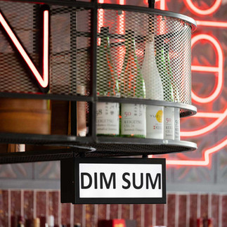
Dan Dan Goodman’s Fields takes a more industrial approach whilst still honouring Feng Shui principles. Exposed concrete walls and ductwork provide a strong, earthy foundation, whilst timber finishes introduce the wood element, fostering a fresh and natural balance. The dynamic red of the neon signage and bespoke lighting invigorates the space, adding a sense of warmth and vibrancy that aligns with the fire element. The overall palette—muted greys paired with pops of red and natural tones—creates a seamless blend of energy and tranquillity, ensuring the space remains both functional and inviting.
For the team at Mailen Design, every project begins with a question: how do we want people to feel in this space? At Dan Dan, we answered with a vibrant yet balanced palette that mirrors the energy of the cuisine and culture it celebrates. Whilst colour is only one aspect of design, it’s a powerful one—capable of shaping mood, telling stories, and enriching experiences.
As we look to the year ahead with Mocha Mousse at the fore, we remain excited to see how colour will continue to influence the spaces we create. After all, a single hue has the power to transform not just a room, but the memories made within it.


